
WordPress Mobile Optimization 2025
TL;DR: WordPress mobile optimization in 2025 is critical for SEO and user engagement, as over 62% of web traffic is mobile and Google prioritizes mobile-first indexing. Key strategies include using responsive themes like Astra or Neve, optimizing images for speed, and ensuring fast load times to meet Core Web Vitals. Benefits include higher rankings, lower bounce rates, and improved conversions, achieved through lightweight design, mobile-friendly navigation, and tools like WP Rocket or Cloudflare.
With mobile devices accounting for over 60% of global website traffic in 2025, having a mobile-optimized WordPress site is no longer a recommendation—it’s a necessity. Google’s mobile-first indexing means your site’s mobile version is the primary factor for ranking and visibility. A slow, clunky mobile experience can lead to lost traffic, poor user engagement, and lower conversion rates.
This guide provides a comprehensive, step-by-step framework for mastering WordPress mobile optimization. We’ll cover everything from technical performance enhancements and responsive design principles to theme selection and plugin strategies, ensuring your site delivers a flawless experience on any device.
What Is WordPress Mobile Optimization?
The wordpress mobile optimization involves tailoring a WordPress website to deliver a seamless, fast, and user-friendly experience on mobile devices, leveraging responsive themes, optimized images, and mobile-first design practices to meet Google’s mobile-first indexing and Core Web Vitals standards. In 2025, with over 62.5% of global web traffic coming from mobile devices, this process is crucial for ensuring accessibility and performance across smartphones and tablets, directly impacting search rankings and user engagement. The benefits of WordPress mobile optimization include:
- Improving search rankings through compliance with Google’s mobile-first indexing.
- Enhancing user experience with responsive layouts and touch-friendly navigation, reducing bounce rates.
- Boosting Core Web Vitals scores, such as LCP and CLS, for better SEO performance.
- Increasing conversion rates by catering to mobile users’ expectations for speed and usability.
- Strengthening local SEO for “near me” searches is critical for businesses like restaurants and service providers.
- Driving higher engagement and retention through faster load times and intuitive mobile interfaces.
The Core Principles of Effective WordPress Mobile Optimization
Before diving into technical fixes, it’s crucial to understand what “mobile optimization” truly means in 2025. It’s a combination of speed, responsiveness, and usability. Google quantifies this user experience through a set of metrics known as Core Web Vitals.
What Are Google’s Core Web Vitals?
Core Web Vitals are a set of standardized metrics from Google that measure real-world user experience for loading performance, interactivity, and visual stability. These are direct ranking factors, making them essential for SEO.
- Largest Contentful Paint (LCP): Measures loading performance. This is the time it takes for the largest content (like an image or text block) to become visible. A good LCP score is 2.5 seconds or less.
- Interaction to Next Paint (INP): Measures responsiveness. INP assesses the time from when a user interacts with your page (e.g., clicks a button) to when the browser paints the next frame. A good INP is under 200 milliseconds. INP officially replaced First Input Delay (FID) in March 2024.
- Cumulative Layout Shift (CLS): Measures visual stability. It quantifies how much unexpected layout shifts occur during the page’s entire lifecycle. A good CLS score is less than 0.1.
You can measure these vitals using tools like Google PageSpeed Insights and the Core Web Vitals report in Google Search Console. Achieving “Good” scores across all three is a primary goal of mobile optimization.
Part 2: WordPress Website Technical Optimization for Peak Mobile Performance
A technically sound website is the foundation of a great mobile experience. This section covers the essential backend and frontend adjustments needed to make your WordPress site fast and responsive.
Speed & Performance Enhancements
Page speed is a critical factor for both user experience and SEO. A delay of just a few seconds can dramatically increase bounce rates. Here are the key areas to focus on.
Caching Strategies
Caching stores a static version of your site’s files, allowing them to be delivered to users much faster by bypassing server-side processing. There are several layers of caching:
- Page Caching: Saves a full HTML version of your pages. This is the most impactful type of caching for most sites.
- Browser Caching: Stores static assets like images, CSS, and JS in the user’s local browser for faster repeat visits.
- Object Caching: Stores database query results in memory. This is crucial for dynamic sites, like e-commerce or membership platforms, to reduce database load. Tools like Redis or Memcached are often used for this.
Plugins like WP Rocket (premium) and WP Super Cache (free) can easily implement page and browser caching on your WordPress site.
Asset Optimization
- Minification: Reduces the file size of HTML, CSS, and JavaScript by removing unnecessary characters like whitespace and comments.
- Gzip/Brotli Compression: Compresses files on the server before sending them to the browser, significantly reducing transfer times. Most quality hosting providers enable this by default.
- Defer Non-Critical JavaScript: Prevents JavaScript from blocking the initial rendering of your page. Scripts that aren’t needed for above-the-fold content can be loaded later.
- Lazy Loading: Delays the loading of images and videos until they are about to enter the user’s viewport. WordPress has included native lazy loading for pictures since WordPress 5.5, but plugins can offer more control.
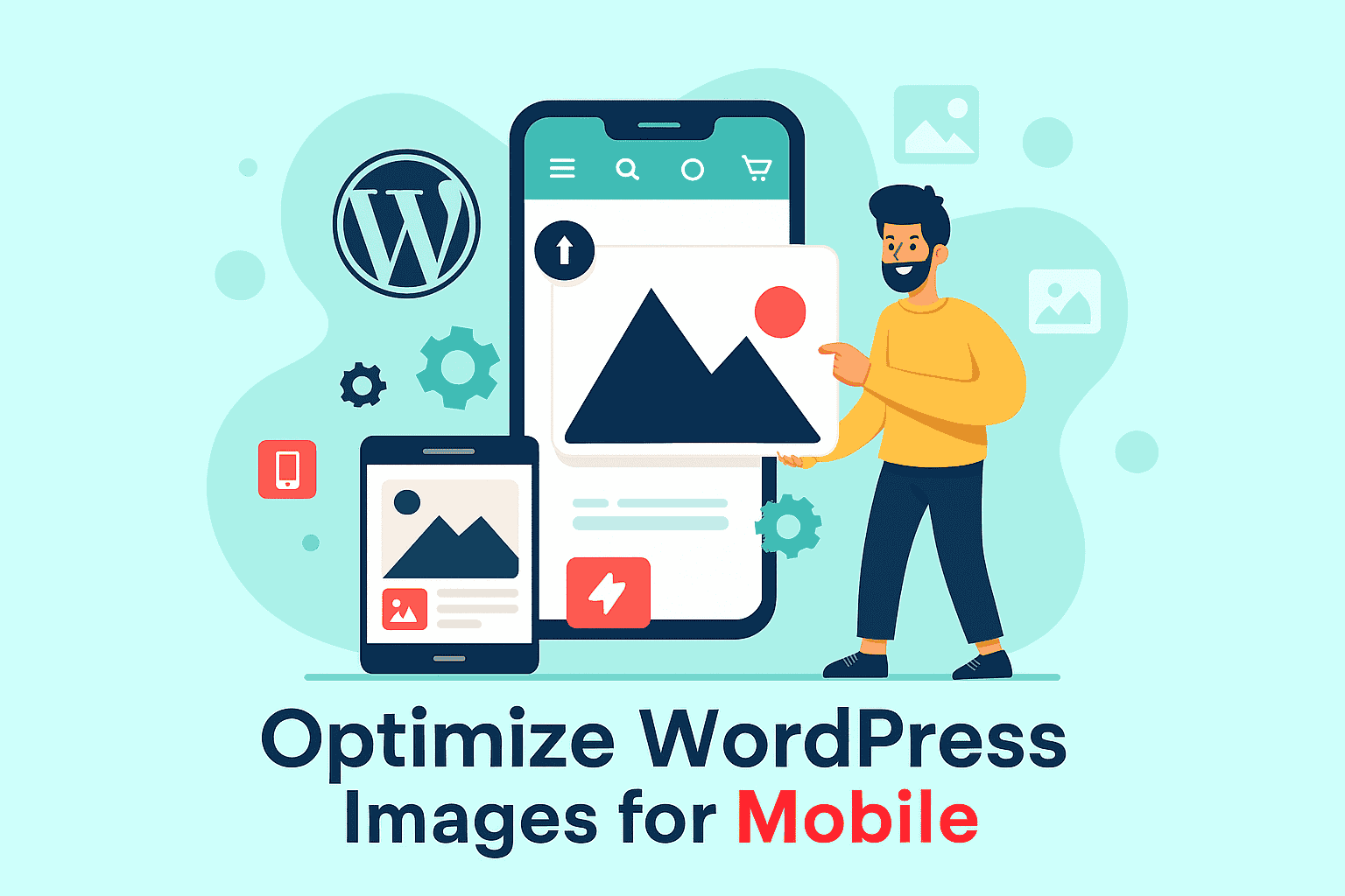
Image Optimization
Images are often the most significant contributors to page weight. Optimizing them is a quick win for mobile performance.
- Use Next-Gen Formats: Serve images in modern formats like WebP or AVIF, which offer better compression than JPEG and PNG. Plugins like Converter for Media can automate this.
- Compress Images: Reduce file size without a significant loss in quality. Tools like Smush or EWWW Image Optimizer can do this automatically upon upload.
- Use Responsive Images: Implement the srcset and sizes attributes in your <img> tags to allow the browser to select the most appropriate image size for the user’s device. WordPress does this automatically for images added through the media library.
Content Delivery Network (CDN)
A CDN stores copies of your site’s static assets on a global network of servers. When a user visits your site, the CDN delivers content from the server geographically closest to them, reducing latency and speeding up load times. Cloudflare is a popular choice, and many men, aged, WordPress hosts integrate a CDN into their plans.
Implementing Responsive Design
Responsive design ensures your website layout adapts seamlessly to any screen size. This is achieved primarily through flexible grids, images, and CSS media queries.
Fluid Grids and Flexible Layouts
Instead of using fixed-pixel widths, responsive layouts use a fluid grid system based on relative units like percentages. This allows the layout to stretch or shrink gracefully. Modern CSS technologies like Flexbox and CSS Grid are the standard for creating these flexible layouts.
Flexible Images
To ensure images scale correctly within their containers, a simple CSS rule is essential:
img {
  max-width: 100%;
  height: auto;
}
Additionally, as mentioned, WordPress’s native use of the srcset attribute helps serve appropriately sized images, preventing a large desktop image from being loaded on a small mobile screen.
CSS Media Queries
Media queries are the cornerstone of responsive design. They allow you to apply different CSS rules based on device characteristics, most commonly the viewport width.
/* Base styles for mobile */
.container {
  width: 100%;
  padding: 10px;
}

/* Tablet styles */
@media (min-width: 768px) {
  .container {
    width: 90%;
    padding: 20px;
  }
}

/* Desktop styles */
@media (min-width: 1024px) {
  .container {
    width: 80%;
    max-width: 900px;
  }
}
A “mobile-first” approach is considered best practice. This involves writing the base CSS for mobile devices and then using `min-width` media queries to add styles for larger screens.
Mobile Testing & Auditing Strategies
You can’t optimize what you don’t measure. Regular testing is vital to ensure your mobile optimizations are working and to catch new issues before they affect users.
Tools and Methods
A combination of automated tools and real-world testing provides the most comprehensive view of your site’s mobile performance.
| Tool/Method | Best For | Pros | Cons |
|---|---|---|---|
| Google PageSpeed Insights | Core Web Vitals & performance diagnostics | Free, provides actionable recommendations, and shows both lab and field data. | Scores can fluctuate; can be overly technical for beginners. |
| Chrome DevTools | Live emulation and debugging | Built into Chrome, simulates various devices and network conditions and allows for live CSS edits. | Doesn’t perfectly replicate real device performance or touch interactions. |
| Real Device Testing | Usability and real-world experience | The most accurate way to test touch targets, navigation, and performance on actual hardware. | Time-consuming, requires access to multiple physical devices. |
| Cross-Browser Testing Tools | Ensuring compatibility | Services like BrowserStack provide access to thousands of real device-browser combinations. | Can be expensive for small businesses. |
Mobile Usability Checklist
When testing, focus on these key usability factors:
✅ Viewport Meta Tag: Ensure <meta name=”viewport” content=”width=device-width, initial-scale=1.0″> is in your site’s <head>. Most modern themes handle this automatically.
✅ Readable Font Sizes: Body text should be at least 16px. Users shouldn’t have to pinch-to-zoom to read your content.
✅ Appropriate Tap Targets: Buttons and links should be large enough to be easily tapped without error. A minimum size of 48×48 pixels is recommended.
✅ Accessible Navigation: Menus should be easy to open and navigate. A “hamburger” menu is a common and widely understood pattern.
✅ No Intrusive Interstitials: Avoid large pop-ups that cover the main content and are difficult to dismiss on mobile, as Google penalizes these.
✅ No Horizontal Scrolling: Content should fit within the screen’s width without requiring users to scroll sideways.
Part 3: Optimize WordPress Implementation Approaches
Now that we’ve covered the technical theory, let’s look at how to apply these principles within the WordPress ecosystem. You can achieve mobile optimization through themes, plugins, or custom code.
Choosing and Customizing Mobile SEO-Friendly Themes
Your theme is the single most critical factor in your site’s mobile-friendliness. A well-coded, lightweight theme provides a solid foundation for performance and responsiveness.
Block Themes vs. Classic Themes
With the advent of Full Site Editing (FSE), WordPress now has two main types of themes:
- Classic Themes: The traditional approach, using PHP templates and the WordPress Customizer for settings. They are mature and widely supported.
- Block Themes: Built for FSE, these themes use blocks for all parts of a site, including headers and footers. They offer greater design flexibility directly in the editor, but are a newer technology.
Both can be mobile-friendly, but Block Themes are designed with modern, responsive principles at their core. When choosing any theme, prioritize those that are lightweight and have a strong performance record.
Popular Lightweight & Responsive Themes
Some themes are consistently recommended for their speed and mobile-first design. Here’s a comparison of two of the most popular options:
| Feature | Astra | GeneratePress |
|---|---|---|
| Performance | Extremely lightweight (under 50KB), known for very fast load times. | Also very lightweight and performance-focused, with clean code. |
| Customization | Extensive options in the Customizer, a large library of starter templates. | Highly customizable, often favored by developers for its flexibility and hooks. |
| Page Builder Compatibility | Excellent integration with Elementor, Beaver Builder, etc. | Works well with all major page builders. |
| Best For | Users who want a wide range of pre-built designs and easy customization. | Developers and users who want deep control and a clean foundation. |
Both Astra and GeneratePress are excellent choices for building a mobile-optimized site.
Using a Child Theme for Customizations
If you need to make code-level changes to your theme (like modifying PHP templates or adding custom functions), always use a child theme. A child theme inherits the functionality and styling of its parent theme but allows you to make modifications without editing the parent theme’s files directly. This is crucial because any changes made to the parent theme will be overwritten during updates.
You can create a child theme manually or use a plugin like Child Theme Configurator to simplify the process.
Plugin-Based Solutions for Slow Mobile Performance
Plugins can automate many mobile optimization tasks, from caching to creating a separate mobile version of your site.
All-in-One Performance Plugins
These plugins handle multiple optimization tasks in one package.
- WP Rocket: A premium, user-friendly plugin that excels at caching, file minification, and lazy loading. It’s often cited as one of the most effective all-in-one solutions for improving site speed.
- NitroPack: An automated, all-in-one service that handles caching, image optimization, and CDN deployment. It’s known for delivering significant performance improvements with minimal configuration.
Mobile Suite Plugins: WPtouch vs. AMP
These plugins take a different approach by creating a dedicated mobile version of your site.
| Plugin | How It Works | Pros | Cons |
|---|---|---|---|
| WPtouch | Creates a separate, elegant mobile theme for your site that is shown only to mobile visitors. Your desktop theme remains unchanged. | Quick setup, passes Google’s Mobile-Friendly Test, doesn’t alter your main theme. | The mobile theme is separate from your core design; advanced features require a Pro version. |
| AMP for WP | Implements Google’s Accelerated Mobile Pages (AMP) framework, creating stripped-down, ultra-fast versions of your pages for mobile search. | Extremely fast load times, potential for better visibility in mobile search carousels. | Limited design and functionality can negatively impact conversions and user experience for some sites. |
Code-Level Modifications for Advanced Users
For those comfortable with code, direct modifications offer granular control over mobile optimization.
Adding Custom CSS
The easiest way to add custom CSS for mobile is through the WordPress Customizer. Navigate to Appearance >Customize >Additional CSS. Here, you can write media queries to adjust styles for specific screen sizes.
Using functions.php
The functions.php file in your child theme is the place to add custom PHP functions. For example, you could conditionally enqueue a mobile-specific stylesheet.
add_action( 'wp_enqueue_scripts', 'my_mobile_styles' );
function my_mobile_styles() {
    if ( wp_is_mobile() ) {
        wp_enqueue_style( 'mobile-style', get_stylesheet_directory_uri() . '/mobile.css' );
    }
}
JavaScript for Mobile Interactions
JavaScript can be used to enhance the mobile experience. The window.matchMedia() method allows you to execute scripts based on CSS media queries, while touch events like touchstart can create more responsive interactions than traditional click events.
Part 4: Real-World Impact & Troubleshooting
Understanding the theory is one thing, but seeing the results and knowing how to fix common problems is what truly matters.
Case Study: The ROI of Mobile Optimization
Steel Seal: 54% Conversion Increase from Checkout Redesign
Automotive parts website Steel Seal was struggling with a complex, six-step checkout process that was particularly cumbersome on mobile devices. By analyzing the user journey, they identified this as a central friction point.
The Solution: The company hired MECLABS Institute to redesign the flow. The team condensed the entire process into just two steps, creating a streamlined, mobile-friendly checkout.
The Result: This mobile-focused optimization led to a 54% increase in conversions, demonstrating the direct financial impact of improving the mobile user experience.
Troubleshooting Common Mobile Usability Issues
Even with the best tools, you might encounter issues. Here’s a quick guide to fixing the most common problems reported by Google Search Console and other testing tools.
| Issue | Common Cause | Solution |
|---|---|---|
| Content wider than the screen | An image or element has a fixed pixel width that breaks the layout on smaller screens. | Ensure all elements use relative widths (e.g., width: 100%;) and images have max-width: 100%;. Check for problematic CSS. |
| Clickable elements are too close together | Buttons, links, or menu items lack sufficient padding or margin. | Increase the space around tap targets. Aim for a minimum size of 48×48 pixels for key interactive elements. |
| Text too small to read | Font size is set in fixed units (px) that don’t scale well on mobile. | Set a base font size of at least 16px for body text. Use relative units like rem or em for better scalability. |
| Viewport not set | The theme is missing the viewport meta tag in the header. | Add <meta name="viewport" content="width=device-width, initial-scale=1"> to your theme’s header.php file, or switch to a modern responsive theme. |
Frequently Asked Questions (FAQs)
Why is my WordPress site not displaying correctly on mobile?
Common reasons include an unresponsive theme, caching issues, plugin conflicts, or faulty custom CSS. Start by clearing your cache and deactivating plugins one by one to identify conflicts. Ensure your theme is responsive and check for CSS errors using browser developer tools.
How do I make my WordPress site mobile-friendly without a plugin?
You can make your site mobile-friendly by choosing a responsive theme, using CSS media queries to adjust layouts for different screen sizes, optimizing images manually before uploading, and ensuring your navigation is touch-friendly. This requires some knowledge of HTML and CSS.
What is a good mobile page speed for WordPress?
A good mobile page load time to aim for is under 3 seconds. Slower speeds can lead to higher bounce rates, as studies show a significant percentage of users will abandon a site that takes longer to load. Tools like Google PageSpeed Insights can help you measure and improve this metric.
Should I use AMP for my WordPress site in 2025?
Accelerated Mobile Pages (AMP) can dramatically speed up mobile pages, but often strips away design and functionality. While beneficial for content-heavy sites like news blogs, it may not be ideal for highly interactive or e-commerce sites. Many site owners have reported a decrease in conversions after implementing AMP. Test it carefully on a staging site before deploying it live.

-
Elevate Your WordPress Site for Mobile Search Success
Mobile optimization is not a one-time fix but an ongoing commitment to providing the best possible user experience. Especially today, when mobile devices account for over 62.5% of global web traffic, and Google’s mobile-first indexing approach is the standard. WordPress mobile optimization is not just a technical necessity—it’s a strategic imperative for businesses aiming to dominate search rankings and captivate users. This comprehensive guide has equipped you with the tools, strategies, and insights needed to transform your WordPress site into a mobile powerhouse, from selecting responsive themes like Astra and Neve to leveraging plugins like WP Rocket and implementing advanced techniques such as AMP and optimized image delivery.
By prioritizing Core Web Vitals, seamless navigation, and local SEO, you can unlock significant benefits: enhanced search visibility, reduced bounce rates, higher conversions, and a competitive edge in “near me” searches. Don’t let a subpar mobile experience hold your business back. Take action now—audit your site with Google’s Mobile-Friendly Test, implement the optimization strategies outlined here, and propel your WordPress site to the forefront of mobile search success. Start optimizing today to ensure your website thrives in the mobile-driven future!
Based on the provided guide and incorporating all your requested keywords, here is a comprehensive summary conclusion:
Conclusion: Mastering WordPress Mobile Optimization for the Future
In an era dominated by mobile devices, where a vast majority of web traffic comes from mobile phones, WordPress mobile optimization is not just a recommendation—it is strategically vital for the viability of any WordPress site. The core goal of effective WordPress mobile optimization is delivering a fast, seamless mobile experience to mobile users on different mobile devices of every screen size.
Search engines like Google prioritize mobile-friendly sites through mobile-first indexing, directly impacting your search rankings and search engine rankings. Achieving high mobile friendliness hinges on excellent sitan e’s performance and a superior mobile user experience, measured fundamentally by Core Web Vitals (LCP, INP, CLS), which assess loading speed, interactivity, and visual stability.
To combat slow mobile performance and ensure your WordPress website thrives, several key strategies must be implemented:
- Responsive Foundation: Use a highly responsive WordPress theme or a responsive theme to ensure the mobile version of your site adapts flawlessly to the user’s device. Responsive design is the bedrock for all mobile visitors.
- Speed Enhancements: Drastically improve mobile page speed and initial page load times by reducing page weight. This involves aggressive image optimization (especially for mobile images), implementing lazy loading for below-the-fold content, and using techniques like mobile caching and leveraging a Content Delivery Network (CDN). Strategies like “leverage browser caching” ensure frequently accessed data is stored in the user’s browser, boosting performance on subsequent visits.
- Advanced Strategies: Consider whether to implement accelerated mobile pages (Accelerated Mobile Pages or AMP) to create ultra-fast mobile pages, though this should be tested against maintaining a smooth mobile experience. Optimizing the delivery of CSS files and utilizing critical CSS are vital for fast mobile rendering.
- Usability Focus: Ensure flawless mobile usability by providing an intuitive navigation that mobile users can easily interact with.
Ultimately, your WordPress site’s slow performance on mobile will cost conversions. By employing these techniques to optimize WordPress, you will transform your website into one of the highly mobile-optimized sites that load quickly and provide a smooth user experience across many mobile devices and varying connection speeds. Regular auditing with tools like Google PageSpeed Insights is essential to maintain a top-tier site’s mobile performance and mobile SEO standing.

With over 27 years of hands-on SEO expertise, starting from my early days as a CFO. Quitting that job to build a top-ranked web hosting business in 1995, I’ve mastered WordPress optimization as a precise engineering discipline. Through extensive research, high-level consulting, and developing a WordPress site that achieved over a thousand organic Google rankings—culminating in a six-figure sale—I’ve decoded Google’s algorithm over 27 years to develop wordpress engineering that transforms underperforming WordPress sites into authoritative powerhouses. Business owners frustrated by stagnant traffic, low visibility, and missed opportunities find relief as I help them deliver measurable ROI through higher rankings, increased leads, and sustainable growth. As owner of dominant city-based SEO platforms in major U.S. markets, I outperform industry gurus, empowering entrepreneurs, local businesses, agencies, and marketers via my WordPress Optimization services at wordpressoptimization.com to unlock their site’s full potential.